
TrueStorm
A responsive company website designed to attract both future clients & hirees, as well as be a source of information and provide a method of contact between the company and its users.
Overview
TrueStorm is a company that helps small-to-midsized businesses solve their day-to-day challenges with SharePoint and Microsoft 365 product implementation. Prior to this, the company didn’t have a website of their own and they were wanting to gain more online exposure to potentially draw in more clientele and catch the attention of future hirees.

My Role
UX Researcher, UI/UX Designer from start to finish
Tools Used
Figma, Zoom, Microsoft Teams
Timeline
80 hours (End of April 2023 - Beginning of May 2023)
Primary UX Research
Going into this project, I wasn’t super familiar with the field of Microsoft consulting, so the initial steps that I took in designing this website revolved around getting to know both the competitors and users better. To do this, I did a competitive analysis to learn more about what already existed, and I also did one on one user interviews to learn what users needs, expectations, and pain points are in this space.
Competitor Analysis
Three competitors of TrueStorm were used in this analysis: Orangutech, StoneShare, and Big Bang 365. Their websites were compared in terms of their strengths, weaknesses, and overall design appearance, but a lot of focus was placed on the website elements and features they chose to include.


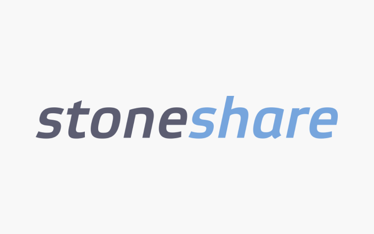
All three websites had a “Services” page, an “About” page, a “Careers” page, and a page where they displayed information about the software they use. Some other features that were included in these websites were a fillable contact page, a client testimonials page, a page displaying business partners, and a company events page.
Overall, this analysis showed me the types of features and elements that typically exist on an IT consulting company’s website, and I was able to use that information when I began to brainstorm TrueStorm’s sitemap.
User Interviews
Four user interviews were conducted over Zoom and Microsoft Teams. Because TrueStorm has the main goals of attracting the attention of both future clients and future IT Consultant hirees, each participant needed to have the prior experience of either hiring a consultant or service, or applying to work at a consulting company. Additionally, both of these experiences needed to take place primarily online.
Some of the questions I asked the participants included:
“Tell me about a time that you needed to hire a consultant or service to help you solve a problem you were having.”
“What section of that consultant/service’s website did you feel was most influential in your decision to hire them? Why?”
“How did you contact your chosen company/service to inquire?”
“Tell me about a time that you were searching for a company to apply for as an employee/consultant.”
“Was there anything particularly frustrating throughout the process of finding and applying to work for your chosen company? Please tell me a bit about that experience.”
Quotes from the participants’ answers were taken out and organized into an affinity map. Within the affinity map, there were six categories: Pain Points, Needs, Expectations, Contacting, and Consultant/Company Selection Process.
Key Quotes
Categories
User Interview Results
Users’ main Pain Points are:
A lack of important information or a lack of clarity in the information presented
When critical information is not organized well or is presented in an overwhelming way
Users Need:
An easy and straightforward website navigation
A page where they can view past experience and acquired skills/specialization
Users Expect:
An easy way to contact the company to inquire
A display of recent works
A bio page where skills/expertise are shown
User Personas
Personas were created for three different interview participants: Dan, Justin, and Troy. They all visit consultant/company websites, but each for different reasons. Dan is a scientist who often needs to hire companies to synthesize his data. He visits their websites to see if they can provide the exact service he needs. Justin is a web developer who is on the job search. He needs to view company websites to both assess if he is a good fit and also to apply. Troy is a business owner who needs to recruit consultants based on a certain criteria. He visits their websites to see if they suit the specific criteria he is provided.
POV Statements & HMW Questions
I chose to put together some POV statements and HMW questions to help me to think deeper and better visualize how I will solve some of the challenges that users are having with consulting company websites.
I’d like to explore ways to make finding the right consultants easier for businesses, so that they can solve problems more quickly and efficiently.
How might we make a consulting company’s website be as easy to navigate as possible for users?
How might we minimize clutter on the landing page and other pages so that users can find what they are looking for easily?
How might we help users to search for specific skills/experience while they are looking for a consultant to hire?
How might we make the information clear and understandable for users?
How might we organize the information so that users can find what they are looking for easily?
I’d like to explore ways to help business owners communicate with consultants that they are looking to hire, so that they can be certain that they are hiring the right consultant for their needs.
How might we create a way for users and consultants to communicate with one another that is easy to use?
How might we build a means of communication into the website itself?
How might we display the company/consultant’s contact info so that is it easy to find and contains the right elements?
Site Map
With the research data acquired and knowing what direction I wanted to take, I went ahead and created a site map. This helped me to better visualize how the website would be laid out and how I wanted to present the features.
Low-Fidelity Wire-Frames
I started planning the layout of each page by sketching out some ideas. I created multiple options for the pain pages: Home, Recent Works, About Us, and Contact Us.
Mid-Fidelity Wire-Frames
Once I decided which of the low-fidelity options I wanted to take further, I created some mid-fidelity digital versions.
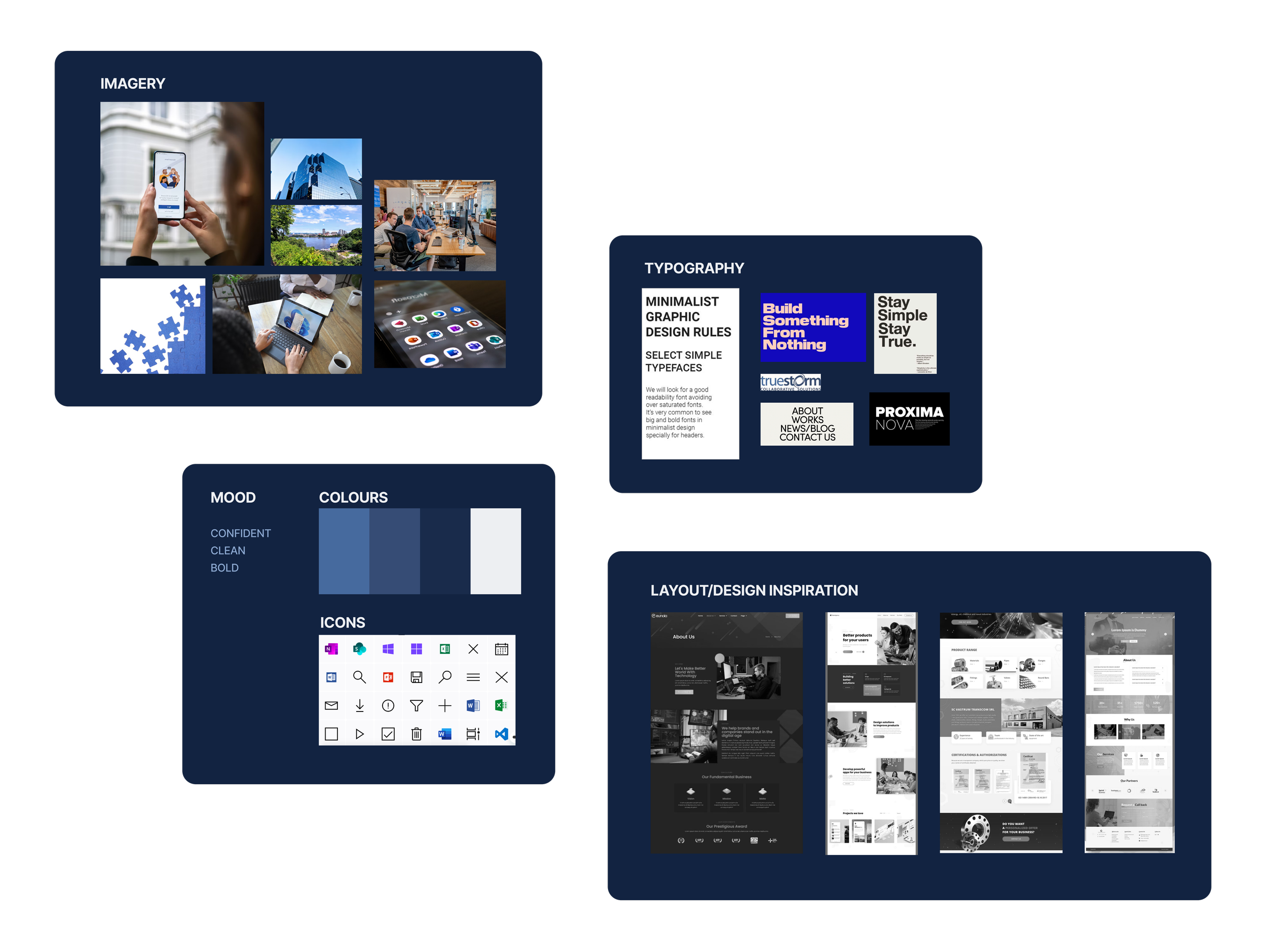
Mood Board
Before putting together the mood board, I made sure to speak with the client to get an idea of the feeling he wanted the website to convey to users. I also viewed the websites of similar companies to get some inspiration. In the end, I went with design elements that are confident and bold yet clean and simplistic.
Logo Development
I began the process by sketching out as many ideas as possible. I knew I definitely wanted to incorporate a “T” somehow, with that being the first letter in the company name, “TrueStorm”. I also played around with storm-themed shapes.
When taking the ideas to my computer, I narrowed it down to 7-8 ideas. Seeing them digitally helped me to better envision what they will look like on the website. At this stage, I decided to confer with the client to see what his preferences were.
The client picked out three favourites that he felt best-communicated the identity of the business. In the end, we chose the T-shaped logo design. I then incorporated the main company colour (blue) and created three variations for various screen sizes.
UI Component Library
With this component library, I continued with the my goal to give this design a bold yet clean and airy feel. I decided that the primary colour will be blue, as blue often conveys a sense of confidence and trustworthiness to users. I kept the typography quite simple, using Krub font for headings and Inter font for the body text. For the iconography, I continued with the clean feel using simple icons with rounded edges. If I were to design this again, I might have gone with sharp edged icons for a bolder look.
High-Fidelity Wireframes V1
When creating the first versions of the high-fidelity sceens, my main goal was to keep the UI simple and not overwhelming for users. I went with a simple horizontal navigation bar at the top of the desktop screens which would be hidden behind a hamburger menu on the mobile screens. This makes navigating the website simple and straightforward for users as it follows common design trends. I also utilized white space to make the content easy to digest, and selected imagery that communicated team collaboration.
Home Page Before
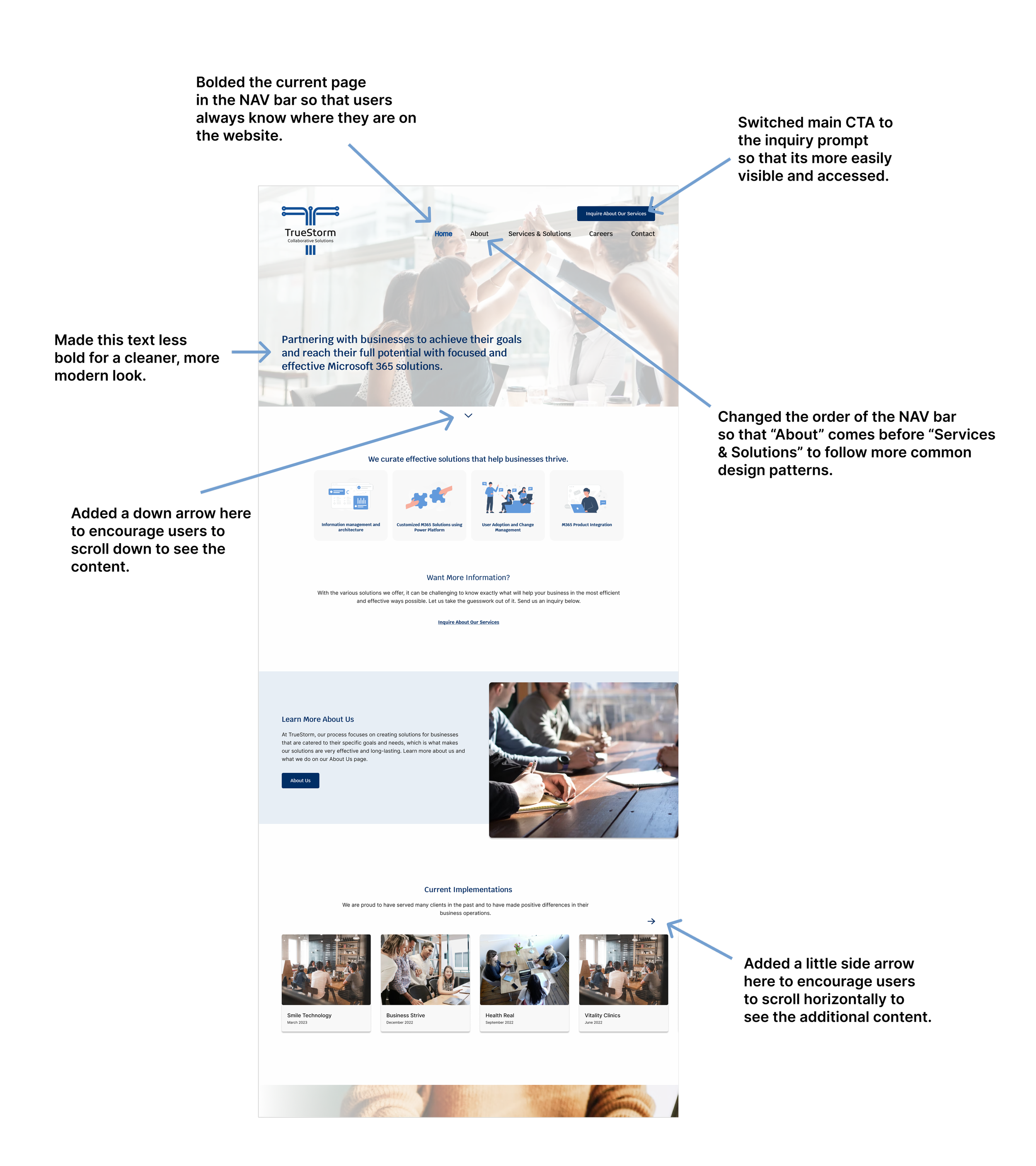
Home Page After
Careers —> Apply
User Testing
After designing the high-fidelity wireframes and creating a working prototype, I began user testing. I tested four participants with four tasks:
Finding out what TrueStorm does
Finding and applying for a job at TrueStorm
Inquiring about TrueStorm’s services
Contacting TrueStorm
Once user testing was finished, I organized the findings and participant quotes into two affinity maps: an effort to impact grid, and a frequency to severity grid.
High-Fidelity Wireframes V2
During the user testing sessions, the main mistake that the participants made was during task 3. Instead of clicking the inquiry link to take them through the inquiry flow, 50% of participants went straight to the contact page. To make the inquiry flow more visible and accessible, I moved the “send us an inquiry” button to the top of every page, as a part of the main navigation.
Other than that, the user testing went quite smoothly, so I just made a few minor changes to the design to improve the overall user experience:
Next Steps…
Additional user testing on both desktop and mobile versions after the most recent high-fidelity revisions would be beneficial to ensure that this website has optimal usability.

View Other Case Studies: