
Momentum
Helping users improve their health one workout at a time.

Overview
People all over the world have a desire to have good health. A key proponent in having good health is exercising regularly. That said, many individuals find that maintaining a regular exercise routine can be difficult in addition to their other daily responsibilities. Furthermore, people can struggle to be motivated to exercise, as it is not always an enjoyable experience for them.
Momentum is a mobile web app that is designed to help people exercise regularly despite these challenges.
My Role
UX Researcher, UI/UX Designer from start to finish
Tools Used
Figma, Zoom
Timeline
2 months (February 2023 - March 2023)
Primary UX Research
At the beginning of my design process, I wanted to get a better idea of both what already existed in the world of digital fitness products, as well as what real users are needing and expecting from a motivating fitness website. To do this, I decided to do a competitive analysis with pre-existing fitness apps and websites, and then user interviews with people who have varying levels of experience with exercise and digital fitness products.
Competitive Analysis


Four popular fitness websites/apps were compared in this analysis: CrossFit, MyFitnessPal, FitOn, and Nike Training. This study revealed that there are five main features that these products offer to help users exercise regularly:
Exercise Data Tracking
Fitness content (trainer-led videos, imagery, and articles)
A medium for socialization with other users
In-person exercise scheduling
Nutrition help and tracking
User Interviews

User interviews were conducted in-person. Five users were interviewed who fall under the following demographics:
Age range: 22-55 years old
Gender: 3 male, 2 female
Home city: Montreal, QC or Ottawa, ON
Either has a regular exercise routine established, doesn’t exercise regularly, or has an on/off exercise routine
All have used fitness websites/apps before
All have a desire to have good health
User Interview Data Synthesis: Affinity Mapping
Quotes were extracted from each user interview and were organized in an affinity map with six categories: Preferred Exercise Methods, Exercise Pain Points, Why people exercise, Motivation Techniques, Scheduling Exercise, and Experiences with Exercise Technology. Doing this made it much easier to process the data and understand the points that the users made during the user interviews.
User Interview Insights

Users choose to exercise because of the way it makes them feel physically and mentally.
Users’ pain points with exercise include a general lack of excitement around it, planning difficulties, and cost.
Users are most motivated by quantifying/tracking their progress.
Users’ needs for future exercise technology include progress tracking, exciting & educational content, a way to plan workouts into their schedules, and a means to connect with others who have the same motivations.
User Personas
With the information I gathered from the user interviews, I created three user personas that represented the different types of users who might use this website. I found that I continuously referenced these throughout the entire design process, which helped me to always remember and prioritize the needs of the users.
POV Statements & HMW Questions
With the user personas created, I was able to come up with some POV statements based on the needs and pain points that were brought up in the user interviews. From there, I wrote down some HMW questions for each POV statement, which helped me to start visualizing some solutions.
I’d like to explore ways to help people who are bored with their exercise routine to gain new ideas for how to change up their exercise routine, as becoming bored with exercise can ultimately lead to a hiatus in their exercise journey.
How might we help users to enjoy exercising?
How might we show users new ways to exercise?
I’d like to explore ways to help people who struggle to maintain a consistent exercise routine to see the progress that they are making on their exercise journey, as seeing progress helps motivate them.
How might we help users to track their progress during an exercise program?
How might we help users to see that exercising is improving their health?
Site Map
With the three Personas and POV & HMW statements in mind, I created a Site Map with three main features. These features include a large database of exercise content to keep exercise exciting, a profile page where users can view their progress, and a social feed so that users can connect with one another.
User Flows
With the site map created, I was able to start mapping out the flow of individual tasks. First, I created some user flows which outlined every possible path one can take towards completing - or not completing - a task.

Task Flows
Then, I created three task flows which outlined the most efficient path one can take towards completing the given task.

Low-Fidelity Wireframes
After putting together the site map, user flows, and task flows, I had all of the information I needed to start the wire-framing process. I began by sketching out some ideas for the layout of each page on the website.
Mid-Fidelity Wireframes
Once I finished with the low-fidelity sketches, I decided which ideas I wanted to take further into mid-fidelity. I then created digital mid-fidelity screens for the whole website, using the sketches and user/task flows as a guide.
Flow: View a Workout Video
Mood board
With the features, flows, and layout established, I started brainstorming some brand names and wrote out the brand’s core values. I used those to create a mood board of imagery to use for inspiration when creating the final UI components and designs.
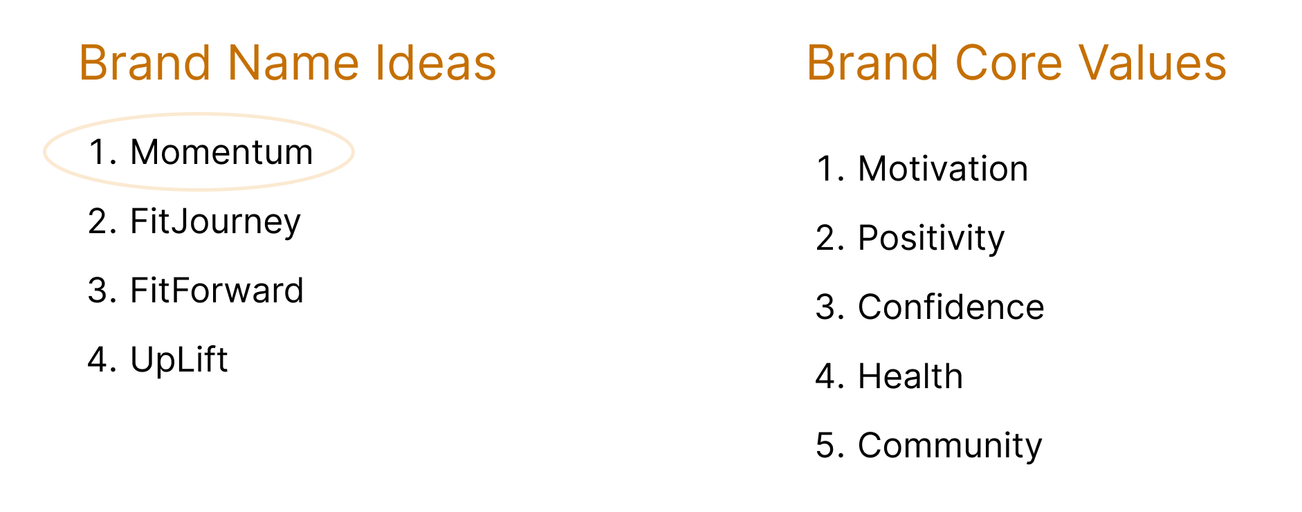

Logo Creation
For the logo design, I wanted it to be simple while still being bold and staying true to the brand name “Momentum”. I started by sketching out some ideas and felt that the arrow design communicated the concept of movement the most clearly. The three arrows represent consistent movement, which can be tied back to the goal of this product, which is helping users maintain a consistent exercise routine. I created three versions of the final logo design to suit different screen sizes.
Ideation
Final Design
High-Fidelity Wireframes (V1)
With the visual design of the high-fidelity wireframes, I was going for a bold yet inviting feel. To accomplish this, I chose to use both light and dark blues throughout, and a simple font that was neither too bold nor too light.
Some key design decisions included:

Flow: View a Workout Video
User Testing
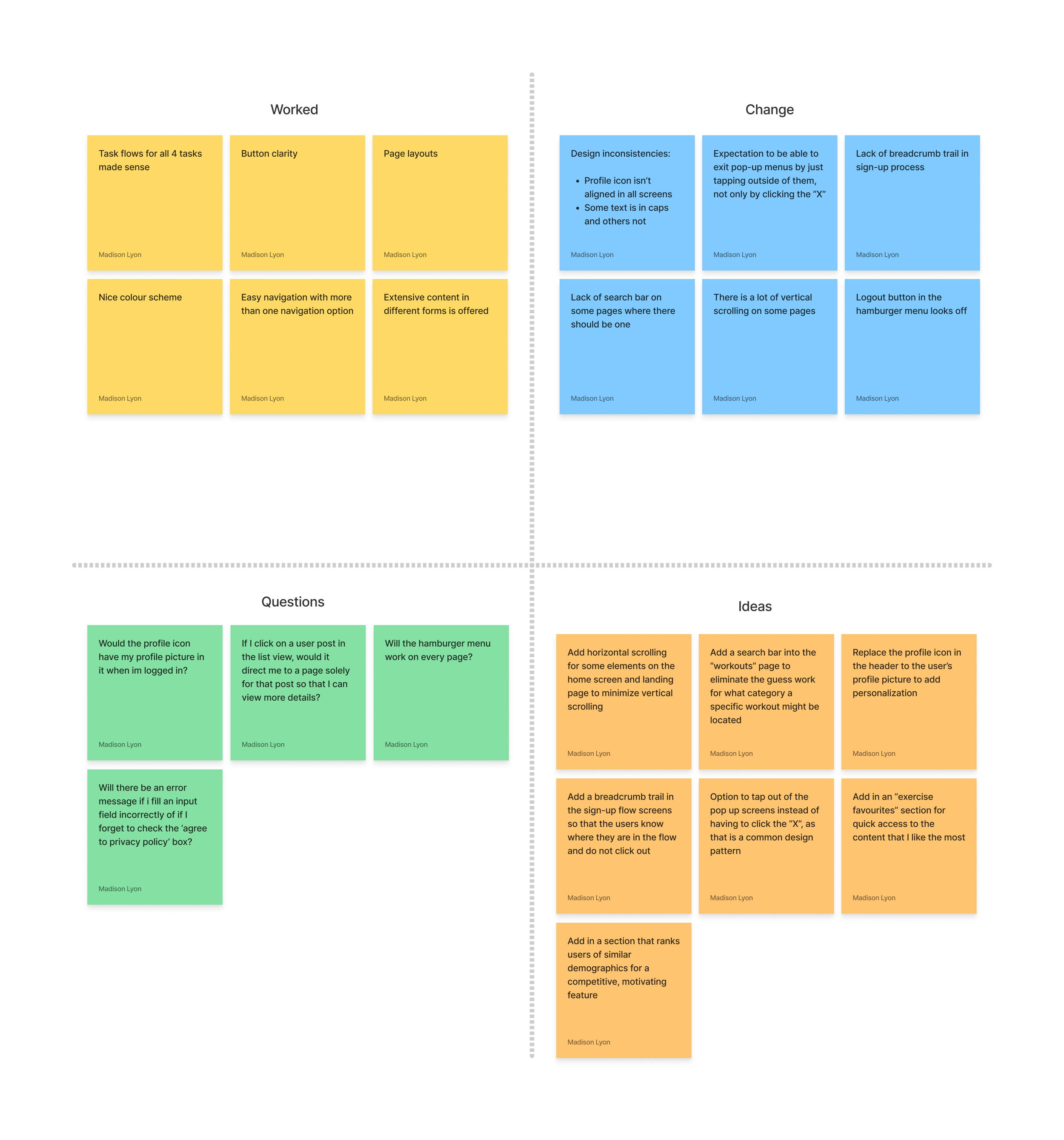
After creating a prototype with the high-fidelity screens, it was time to test the product with real users. I tested five participants during these sessions. I recorded each session and extracted key quotes from the recordings. Then, I organized these quotes into four categories: Worked, Change, Questions, and Ideas. Last, to organize the quotes further, I placed the actionable feedback onto a frequency to severity grid.

Iterating to Create the Final Product
After the user testing sessions, I was happy to see that the participants were content with their experience using this website. This said, there were a few things that I wanted to tweak and fix relating to the participants’ feedback and my own observations during the testing.
To ensure optimal usability, some other changes I made included:
Adding a search bar to more screens to enhance user freedom and accommodate users looking for a specific content item
Adding a stepper icon in the Sign-Up screens so that users know where they are in the flow
Adding horizontal scrolling elements to minimize vertical scrolling
My Key Takeaways
This project really showed me the importance of collaborating with my users. Since I too had experienced the problem to be solved, I went in thinking that I knew exactly how to design the product and that user research was not going to change my design plan very much. Boy, was I wrong! The users I interviewed in the early stages surprised me with their experiences, thoughts, and insights regarding exercise and exercise-related technology. Using that research data to guide my design decisions really helped this design to be successful.
Future Considerations
As a new designer, I would like to improve my UI design skills in my future products so that they look more modern and fresh. To do this, I plan on conducting more thorough competitive analyses and spending more time looking at design inspiration.

View Other Case Studies:

