

Instagram Feature: Post Organization
With this new feature, we wanted to give instagram users more freedom when it comes to how their posts are organized on their profile page.

Overview
Instagram is a website and mobile app that allows users to connect with one another through the sharing of photos and videos.
While it is a very popular and well-loved platform, it currently does not provide users with a lot of freedom when it comes to how their posts are organized on their profile page.
This new feature aims to give users the ability to customize the organization of their posts on their profile page. This will not only allow users to find certain posts more easily, but it will also give businesses and freelancers additional ways to showcase their services/products.

My Role
UX Researcher, UX/UI Designer from start to finish
Tools Used
Figma, FigJam, Zoom, Microsoft Teams, Excel, Google Drive
Timeline
80 hours in May of 2023
Primary Research Methods

Competitive Analysis
We began the UX research process with a competitive analysis. Four other social media/content sharing apps were compared: Facebook, YouTube, Tik Tok, and Pinterest.
Ultimately, it was determined that, out of the five apps that were compared (including Instagram), Instagram was the only platform that didn’t give their users any customization abilities when it comes to how their profile posts are organized.

User Interviews
First, it was important for us to understand users’ experiences with instagram in general, more specifically their motivations for using instagram, their pain points with instagram, and their needs/expectations for Instagram going forward.
Next, we wanted to determine if people would use and enjoy this proposed feature. Furthermore, we wanted to figure out the ways in which users would like to organize their posts on their Instagram profile if given the chance.

Competitive Analysis
User Interviews
Four people were interviewed via Zoom and Microsoft Teams during this phase. They were selected based upon whether or not they have an Instagram account and whether or not they post photos/content on Instagram.
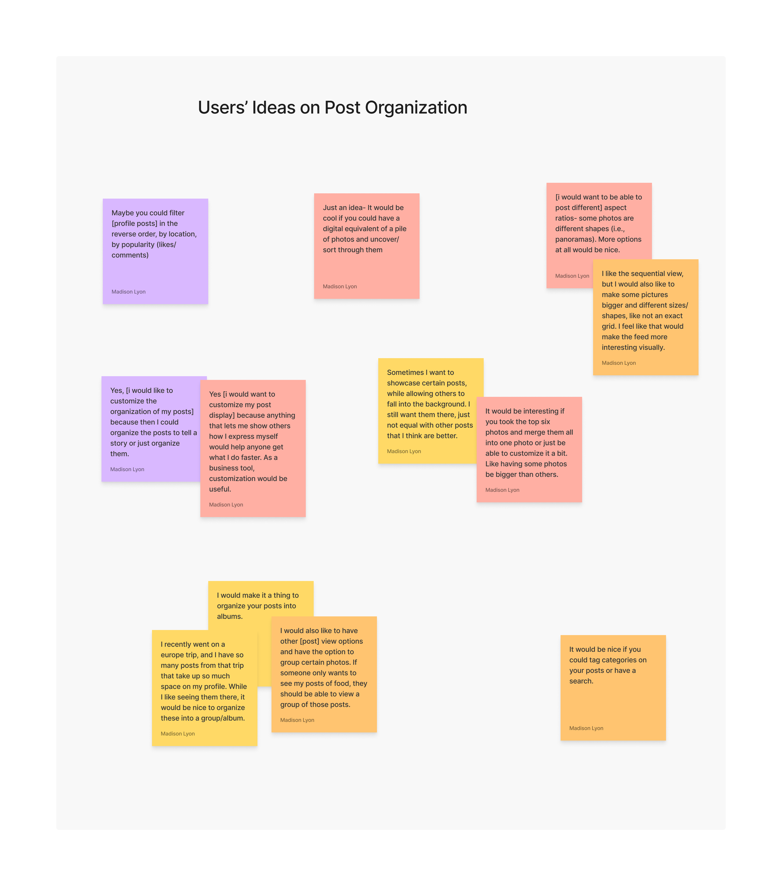
Quotes from the interviews were pulled out and grouped into 6 main categories:
Motivations for using Instagram
Likes about Instagram
Pain points with Instagram
Instagram behaviours
Ideas on post organization
Opinions on Instagram profile pages


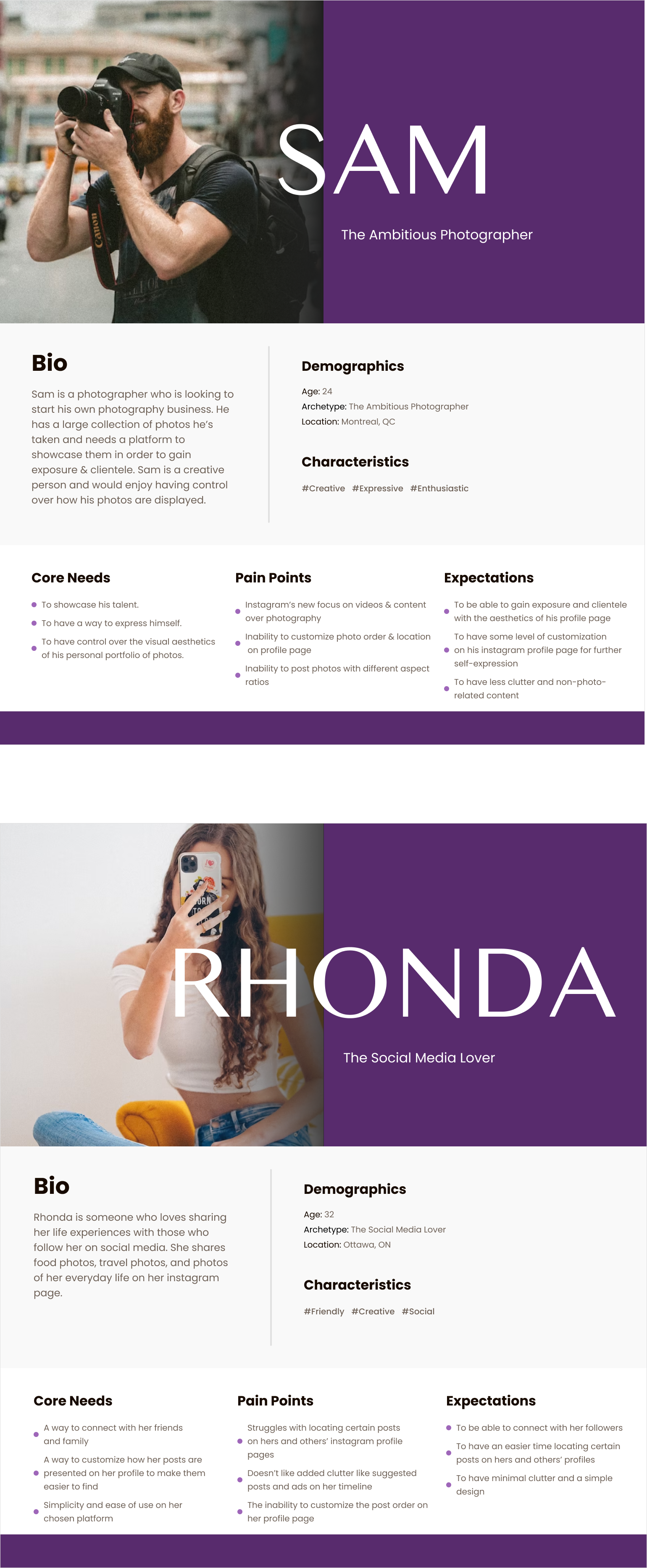
User Personas
With the insights gathered from the user interviews, two personas were created. These personas represent two key categories of our target audience: Instagram users. One category is people who use Instagram for business/promotional purposes, and the other category is people who use instagram for leisure and to stay connected with their followers.
POV Statements & HMW Questions
I’d like to explore ways to give users more control when it comes to how their posts are organized and displayed on their instagram profile, so that they can further express themselves creatively to their followers.

How might we allow users to organize their posts in various different ways?
How might we make customizing the organization of their posts easy for users?
How might we develop methods of post organization that users will want to implement?
How might we choose the location of the feature so that users will find it easily and feel a desire to use it?
I’d like to explore ways to make it easier for users to locate specific posts and items on instagram, so that their overall user experience can be improved.
How might we allow users to organize their posts to make them easier to find on their page?
How might we minimize clutter on the page so that posts and other items are easy to find?
How might we choose the location of the post organization feature so that users will find it easily and use it?
After synthesizing and reviewing the research insights, we decided on what this feature will include. We decided to keep the pre-existing grid view on users’ profiles, since it was expressed by many of the interview participants that the grid view is useful in it’s own right. With this in mind, we decided that this new feature will include two functions: sorting the pre-existing grid view in various different ways, and new post view, which will consist of user-created post albums.
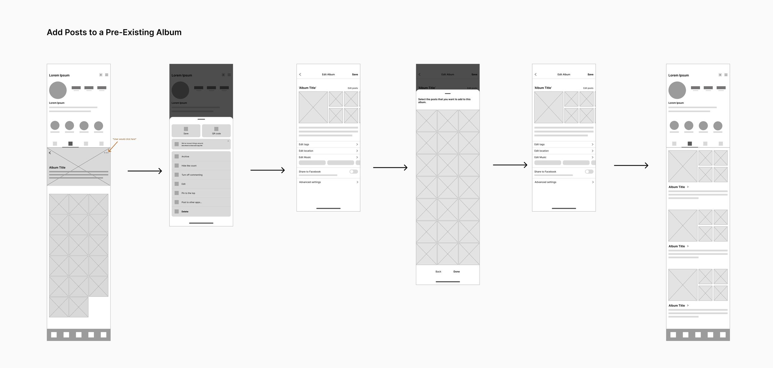
Task Flows
Using the insights we got from synthesizing the research data, we created some task flows that would exist in this feature. We knew that our two main functions would be grid view sorting and user created albums, and wanted this feature to work similarly to the other features within instagram, so we kept those in mind with these flows.


Creating the Designs
Once the features and flows were decided, it was time to start the design ideation process. I started by sketching some ideas for the album view pages, and then created some mid-fidelity digital versions of all of the screens that will be included in the feature.
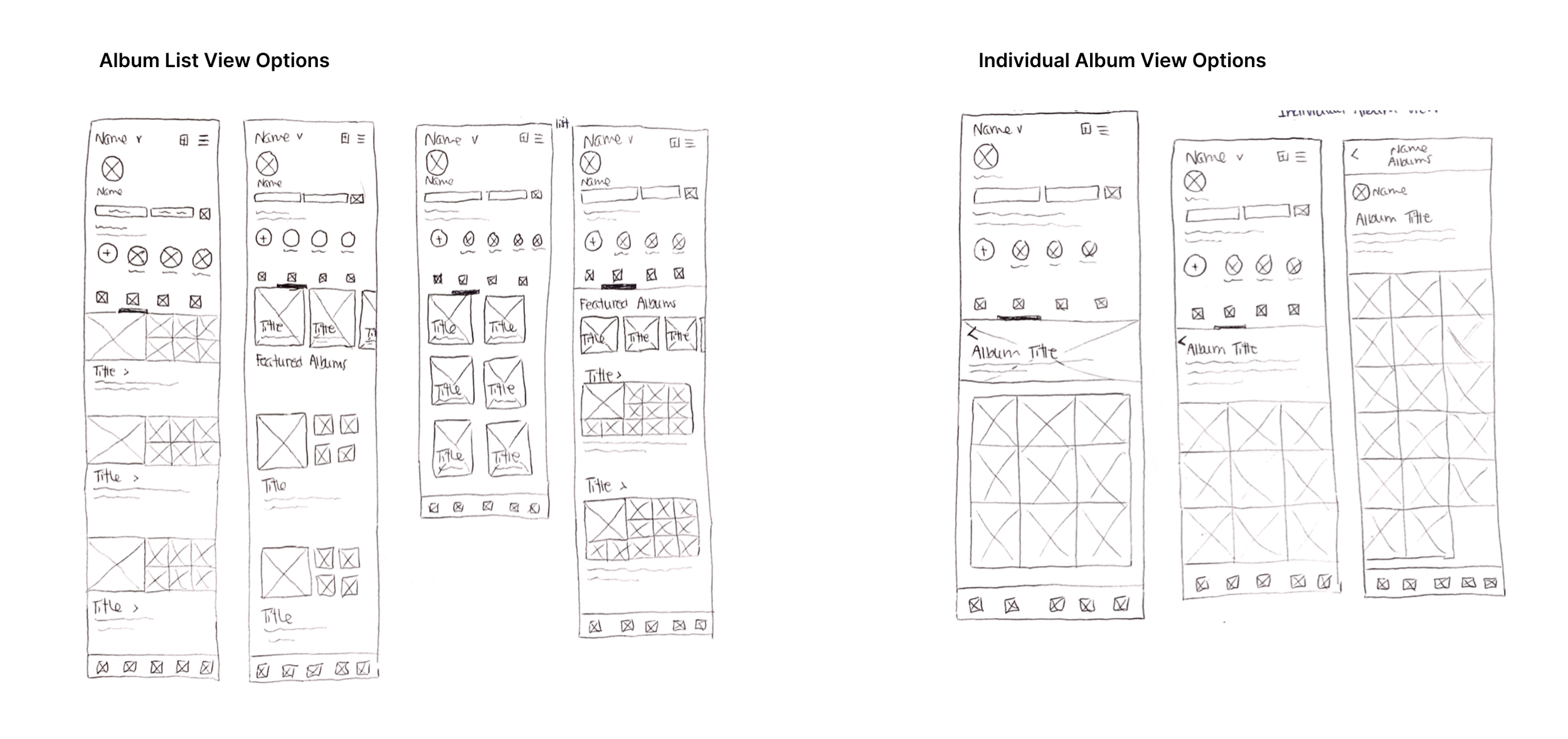
Mid-Fidelity WireFrames

Grid View / Create
Add Posts / Review Album
Grid View / Album View
High-Fidelity Wireframes
When creating the high-fidelity screens for this feature, the main focus was seamless integration. I wanted the new screens to look like they are a part of the Instagram app and I wanted the location of this feature to blend with the features that already exist. To do this, I consistently used Instagram’s already existing screen designs as a reference.
Task Flow: Create a New Album
User Testing
Once the wireframes were completed, I created a prototype of the new feature and tested it with four participants. The participants had varying levels of experience with instagram prior to the testing. We instructed them to complete five different tasks and recorded their feedback and body language throughout. Once the sessions were completed, the data was placed onto a feedback grid.
User Test Tasks
View the posts in the album called “Adventuring”.
Sort these grid view posts by popularity.
Create a new album.
Add more posts to the album called “Me and My Friends”.
Remove some posts from the album called “Me and My Friends”.

The main finding from the rounds of user testing was that the ‘Sort by Popularity’ task was troublesome. More specifically, finding the initial button to open the sort menu was difficult to figure out. To keep Instagram’s initial design, I put the sort menu in the grid view icon. 3/4 participants figured out that they needed to tap on the grid icon to open the sort menu, but 1 participant was unable to.
The other four tasks went pretty smoothly. The participants commented that this new feature felt like it belonged within Instagram. On a scale from 1-10, with 1 being the most frustrated and 10 being the most delighted, 1 user rated their experience using the website an 9, 2 rated it an 8, and 1 rated it a 7.
High-Fidelity Wireframes V2
After the user testing sessions, I was glad to see that the participants enjoyed using this feature. When deciding on things to change or improve, I prioritized making the grid view sort button more intuitive. Other than that, the participants seemed to have an easy time navigating the feature, so I just made some additional very minor tweaks to ensure optimal usability and a delightful user experience.
My Solution for the Grid View Task
Because the sort menu was the biggest challenge for the user testing participants, I prioritized making this function more intuitive.
Since it’s quite common for sort menus to be hidden in drop-downs, I decided that I would place a down arrow beside the grid icon to suggest to users that there is a drop down here with more options relating to the grid view.
Next Steps…
I feel that this project would greatly benefit from another round of user testing with more participants. There were a few minor changes made to the design after the initial user testing, and due to time constraints, there wasn’t an additional round.

View Other Case Studies:

