

RemindMed
Giving users the power of independence when it comes to staying on top of their medications and managing their symptoms.

Overview
The vast majority of individuals around the world take medication on a consistent basis. Some only need to take one or two medications, while others have several that they need to keep track of. For some, medication is essential for survival, and making mistakes when it comes to taking it is not an option. This said, sometimes people forget to take it, accidentally take the wrong dose, lose track of when they need to get their prescriptions refilled, etc.
RemindMed is a mobile app that is designed to help users manage their medications through scheduled reminders. It also helps them to track their physical symptoms through a health diary function, and provides a short cut for them to contact their pharmacy and other members of their health team for medication assistance.
My Role
UX Researcher & Designer from start to finish
Tools Used
Figma, FigJam, Zoom, Google Sheets
Timeline
80 hours in June of 2023
Primary UX Research
I decided to do my primary UX research through two methods: a competitive analysis and user interviews. I chose a competitor analysis because I didn’t know a lot about medication-related apps prior to this project and I wanted to learn more about what was already available to users. I chose user interviews as my other method to gain as many insights from real users as possible regarding their pain points and how I can improve their experience with taking medication.
Competitive Analysis
To begin the research process, I compared five other medication tracking apps to get a good idea of their common features, as well as their strengths/weaknesses.

User Interviews
After the competitive analysis, I interviewed four individuals who have taken prescription medication(s) to learn their needs, pain points, and expectations around an app that is meant to help people stay on top of their medications. Once the interviews were completed, I took out quotes from the participants and organized them into an affinity map to better visualize the data.


Insights Gained
From the user interviews, we learned that users are wanting an app that will act sort of like a virtual assistant when it comes to managing their medications. Some of their needs include:
Reminders for when to take their medications and request medication refills at the accurate times
An easy way to request refills
To be able to keep a list of all of their current and previous medications
A link to their pharmacy and their health care team
To be able to track their symptoms/side-effects
User Personas
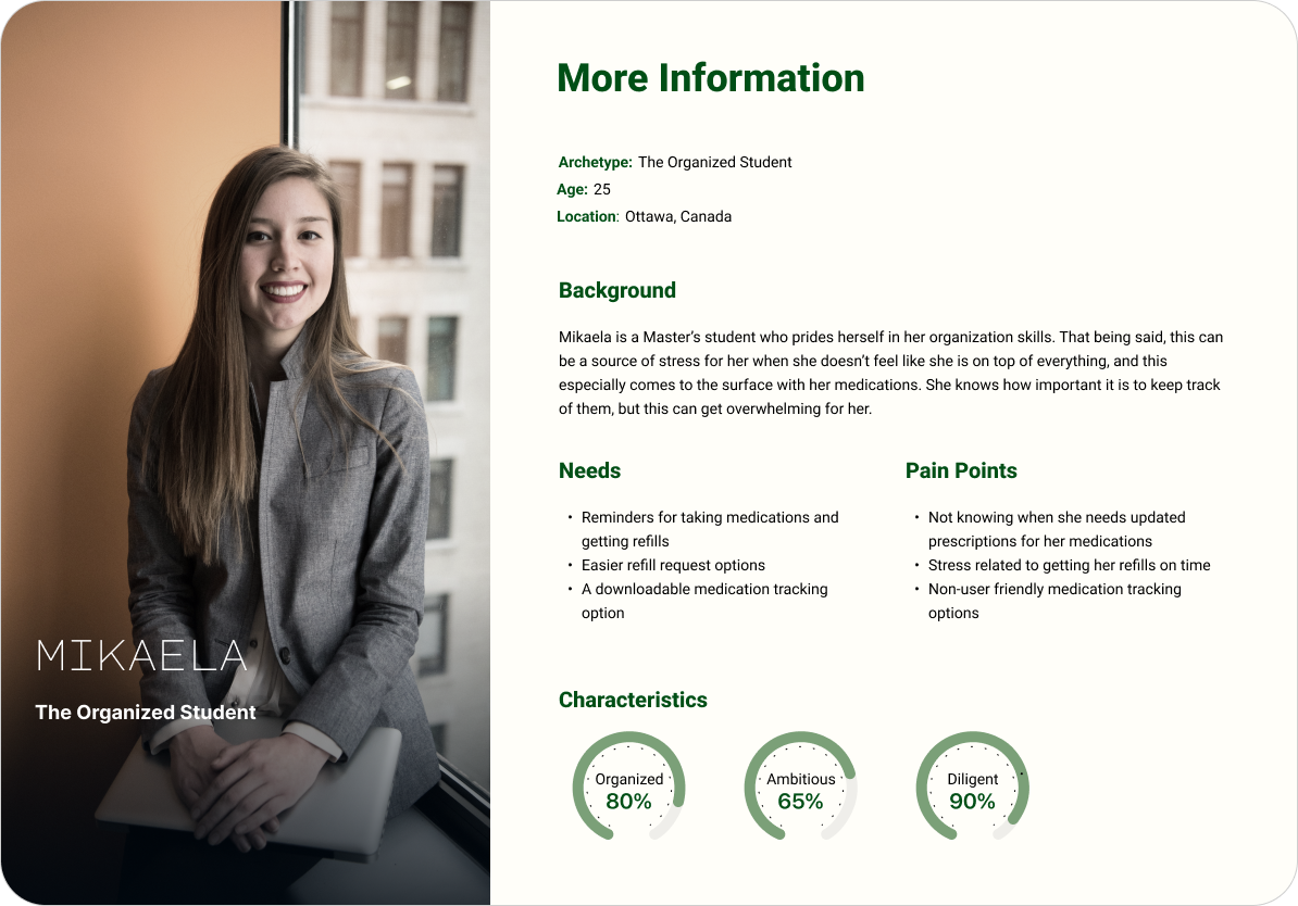
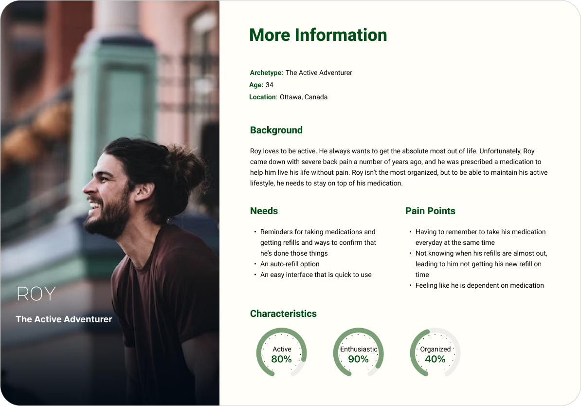
After the introductory research was complete and the data was analyzed, I put together two user personas to reference when I got to the ideation phase. These two personas were created based on the perspectives of my interview participants.
The first persona is Mikaela, who enjoys being organized but tends to worry and get overwhelmed by the thought of forgetting things. She craves the peace of mind knowing that she is on top of her medications and health.
The second persona is Roy. Roy is enjoys living life to it’s fullest and doesn’t like to stress over the details. He is not the most organized, but he understands the importance of staying on track with his medication so that he can keep up his active lifestyle.
POV Statements & HMW Questions
I decided to put together some POV statements and HMW questions to give me some actionable design guidance points that were driven by the data. Asking HMW questions helped me to better visualize how I wanted to solve the problems that users were having with staying on top of their medications.
POV #1
I’d like to explore ways to help users remember and keep track of all of their medications so that they can maintain an optimal state of health.
How might we help users to remember to take their medications at the right times?
How might we help users to get their refills before their medication runs out?
How might we help users know when an updated prescription is needed?
How might we help users to know what medications they’re on and have taken in the past?
How might we help users feel accomplished once they’ve taken their medications?
POV #2
I’d like to explore ways to help users get their refills in a more delightful, easy, and efficient way so that they are less likely to procrastinate and not get their refills on time.
How might we design a feature that allows the app to connect to their pharmacy?
How might we design a feature that allows users to request refills through the app?
How might we design an auto-refill-request feature so that users don’t need to remember to request it themselves?
How might we give users peace of mind knowing that they are on top of their refills?
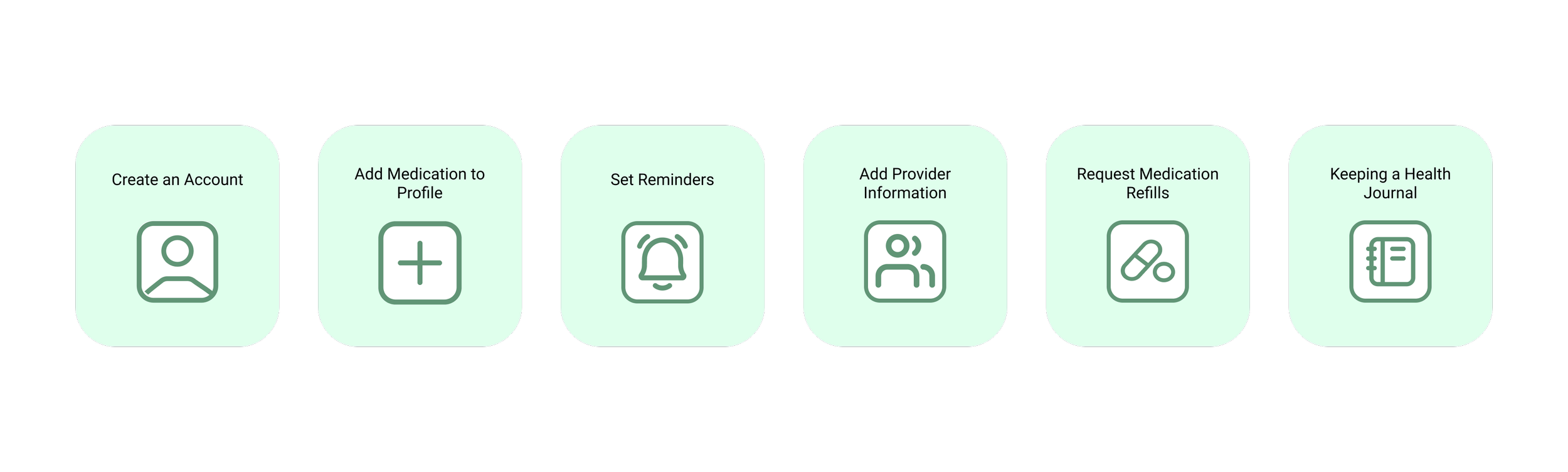
Features
After synthesizing the research data, we were able to start thinking about what features we want this app to include. We wanted to keep it simple and easy to use, while still including enough features for it to be uniquely helpful for users. At this stage, we knew we wanted to design the following features:
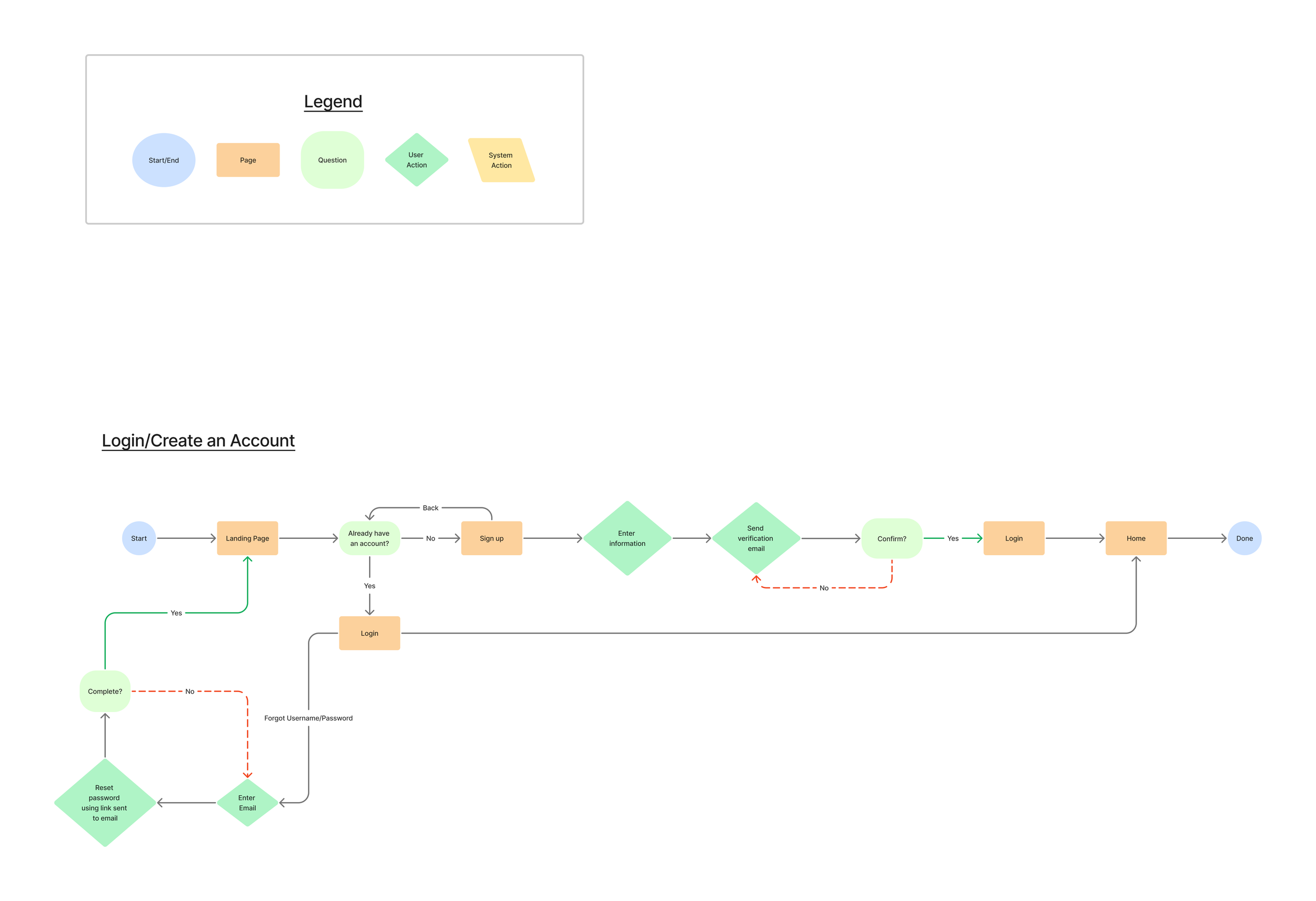
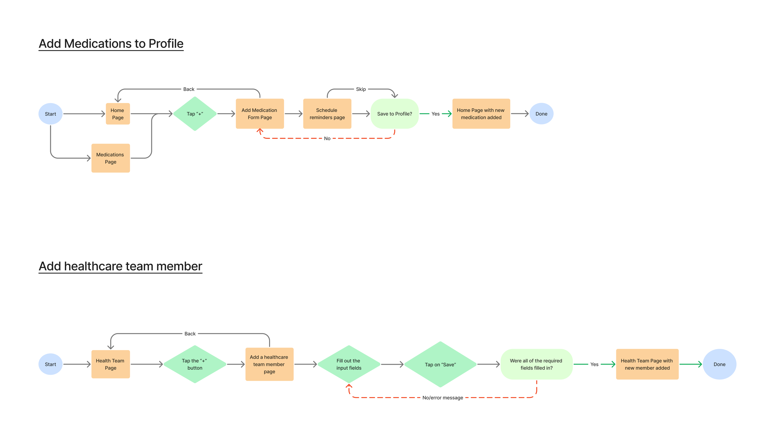
User Flows
With the features determined, I started creating some user flows. This was helpful for this project because it helped me to visualize the different pathways that users could take to complete each task, and ways in which they can make errors or run into frustrating issues with the app.
WireFrames
Once we decided on the features and the user flows were created, I started creating the designs. I began by sketching out some options for the layout of the 4 main screens: Home, Medications, Health Team, and Profile/Account. I then made digital versions.
Low-Fidelity Sketches
Mid-Fidelity Digital Versions
Mood Board
I knew from the start of this project that I wanted the overall look and feel of this app to be light, airy, and calming. With this in mind, I chose a colour palette consisting of neutral greens and blues, a light and simple font, and a clutter-free UI.
Branding/Component Library
Continuing with the look and feel of the mood board, I created a component library to use as a guide for the high-fidelity screens.
High-Fidelity Wireframes V1
To continue with the calming and airy feel shown in the mood board, I put together the first versions of the high-fi wireframes using a calm & neutral palette, a simple font, and clean imagery.
Before
After
Main Design Elements (shown on the home screen)

User Testing
Once the wireframes were complete, I was able to create prototypes and begin user testing. Four participants were included in the testing and they were instructed to carry out six main tasks on this app:
Create an account with RemindMed.
Add a medication to your account.
Add your doctor to your health team.
Answer a medication push notification and mark that medication as ‘taken’.
Answer a medication refill push notification and mark it as ‘refill requested’.
Create a health diary entry.
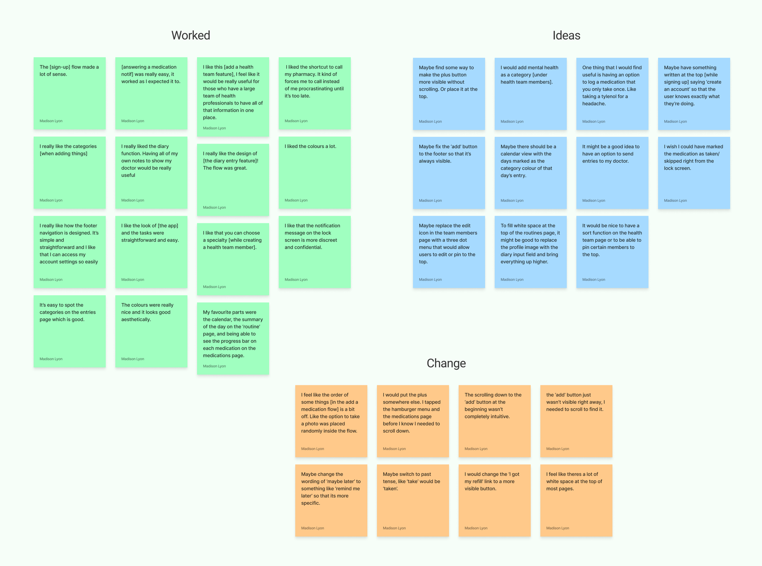
Once the testing was complete, I organized quotes from the participants into three categories: ‘Worked’, ‘Ideas’, and ‘Change’.
After the initial organization into categories, I placed the ‘ideas’ quotes onto an Effort vs Impact grid, and the ‘change’ quotes onto a frequency vs severity grid.


Takeaways from User Testing
At this stage, the user testing helped us to know that the app functioned pretty well already. The main issue participants had was that the ‘add’ button was placed near the bottom and wasn’t visible without scrolling down. Otherwise, all users were able to complete 6/6 tasks efficiently and successfully, and felt calm and content while using the prototype.
High-Fidelity Wireframes V2
While the user testing participants seemed to have a rather seamless experience using the prototype, I still gained some very useful insights and ideas during the testing. I implemented some of those ideas and made a few additional changes to make the overall design as delightful and user-friendly as possible.
The Changes Made Included the Following:
Before
After
Task Flow: Adding a Medication
Next Steps…
I feel that further user testing with more participants should be prioritized to ensure that the level of usability is where it needs to be.
In terms of features, I think that allowing users to request refills from their pharmacy directly through the app would be a great next feature to add. Making requesting refills more convenient was a common ‘needs’ point that many of my user interview participants mentioned, and I think that a feature like that would take this app above and beyond.

View Other Case Studies: